Product Design | Aviation
Increasing Higher-Tier Subscription Conversion Through Contextual Mobile Upsells
Role
Product Designer
Platform
ForeFlight Mobile — iPad and iPhone
Team
Product, Engineering, Design
Timeline
18 months
Overview
ForeFlight’s higher-tier subscription plans include some of the app’s most powerful capabilities: Profile View, Plates on Maps, dynamic weather layers, Airport 3D, and advanced flight planning tools. These features help pilots plan safer flights, better understand terrain and weather, and reduce workload before and during flight.
The challenge was that many users on lower-tier plans only discovered these premium features when they reached a locked state. The business opportunity was clear: users were already showing intent. The design opportunity was to turn those moments into helpful, contextual upgrade experiences rather than generic paywalls.
This 18-month growth initiative focused on improving higher-tier plan conversion across ForeFlight Mobile by designing feature-specific upsell experiences, trial entry points, empty-state messaging, and upgrade flows that respected the pilot’s workflow.
KEY OUTCOMES
IMPACT
16.4%
YoY increase in conversion to higher-tier subscription plans
OWNERSHIP
0 → Ship
Early concepts to validated, engineer-ready designs
SCALE
7 Flows
Feature-specific experiences across Profile View, Weather, Airport 3D, and more
Contextual upgrade moments helped pilots understand premium feature value at the point of intent.
SITUATION
Premium value was hidden behind disconnected upgrade moments
ForeFlight had strong premium features, but many lower-tier users encountered them as blocked functionality instead of clearly understanding their value. Users see this experience when they start a trial for the first time. While the plan comparison screen helped communicate the full range of premium functionality, many users first discovered these features in context, while trying to use them inside the product. The opportunity was to connect those high-intent moments to clearer upgrade paths that explained the value of each plan at the point of need.
A pilot might try to open Profile View, overlay an approach plate on the map, turn on a dynamic icing or turbulence layer, or explore Airport 3D, only to see that the feature required a higher subscription plan. These moments showed strong user intent, but the experience often felt like a dead end. It explained that access was restricted, but it did not always connect the feature to the pilot’s goal or explain why upgrading could be valuable.
Because ForeFlight is used in aviation contexts, any growth experience had to be handled carefully. The goal was not to interrupt pilots with aggressive upgrade prompts. The goal was to provide the right explanation at the right moment, especially when the user had already expressed interest in a premium capability.
Basic Plus users reached premium functionality through a natural planning workflow, but tapping Profile View or 3D View produced no response. The opportunity was to turn those moments of intent into a contextual upgrade path that explained what users would unlock.
TASK
Design a mobile growth system that converted intent without breaking trust
My task was to design upgrade experiences that increased conversion to higher-tier plans while preserving the clarity and trust expected from a mission-critical aviation product.
This meant looking beyond a single modal or paywall. I needed to think through the full system: when the upsell should appear, when it should not appear, what message would be most relevant, whether users should be offered a trial, and how the experience should behave across iPad and iPhone.
The design needed to answer several key questions:
- How do we explain premium value in a way that feels useful, not promotional?
- Which feature moments are strong enough to justify an upsell?
- When should we suppress the message to avoid interrupting the pilot?
- How do we create a lower-friction path through trials?
- How do we support the flow after the user taps the CTA?
A growth system, not a single paywall: identify intent, suppress interruptions, guide users through trial or upgrade paths, and preserve confidence in a mission-critical aviation workflow.
01
Intent moment
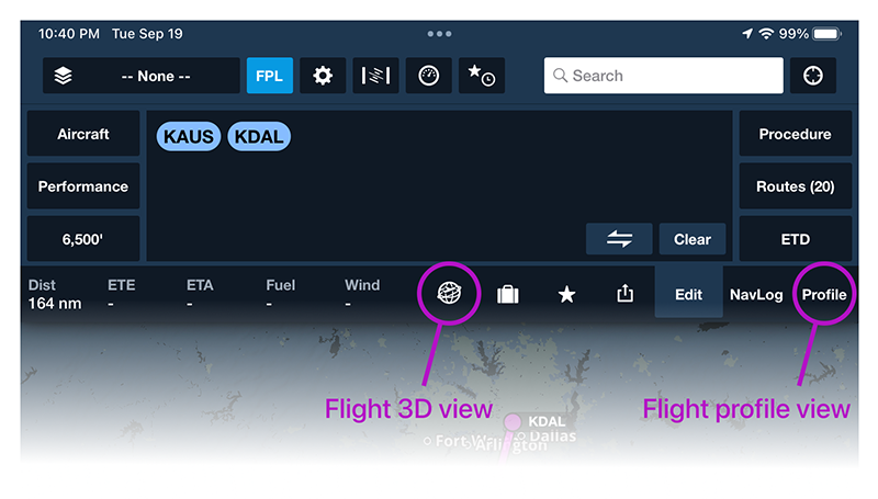
User taps Profile View or 3D View from a natural planning workflow.
02
Trust guardrails
Suppress messages during flight, offline states, or repeated exposure rules.
03
Upgrade path
Explain premium value, offer a lower-friction trial, and support the next step.
Primary success metric: conversion to higher-tier subscription plans
ACTION
1. Mapped high-intent feature moments across ForeFlight Mobile
I started by identifying where users on lower-tier plans were already trying to access higher-tier functionality.
The strongest opportunities came from moments where the user had a clear task in mind, such as trying to view terrain and airspace in Profile View, overlaying plates directly on the map, exploring forecast weather layers, or previewing an airport environment in Airport 3D.
This shifted the strategy from generic upselling to contextual upselling. Instead of promoting a plan in isolation, we could explain the specific value of the feature the pilot was trying to use.
We focused on moments where pilots had already shown intent to use a premium feature.
2. Created feature-specific upgrade messaging
I designed upsell modals with messaging tailored to the feature being accessed. Each message focused on the aviation value of the feature rather than only the subscription tier.
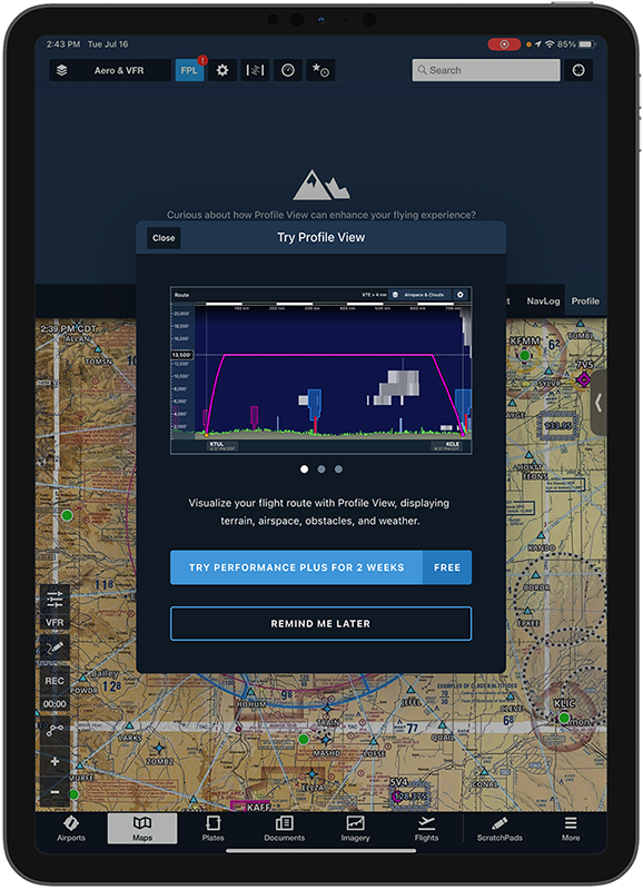
For Profile View, the message focused on visualizing terrain, airspace, obstacles, and weather along the route.
For Plates on Maps, the message focused on giving IFR pilots a better workflow by overlaying geo-referenced procedures and airport diagrams directly on the map.
For dynamic weather layers, the message focused on planning smoother and safer flights with multi-altitude turbulence, icing, and cloud coverage forecasts.
This made the experience feel more relevant because it answered the question the pilot was likely asking: “Why would I need this feature right now?”
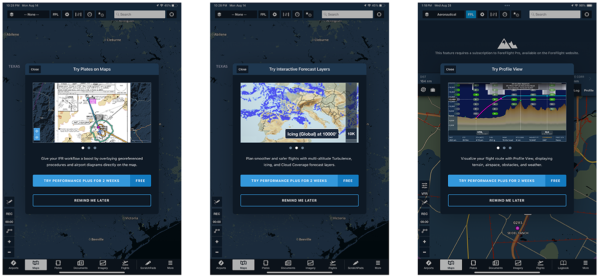
Feature image, benefit-driven copy, primary CTA, secondary action, and dismiss behavior.
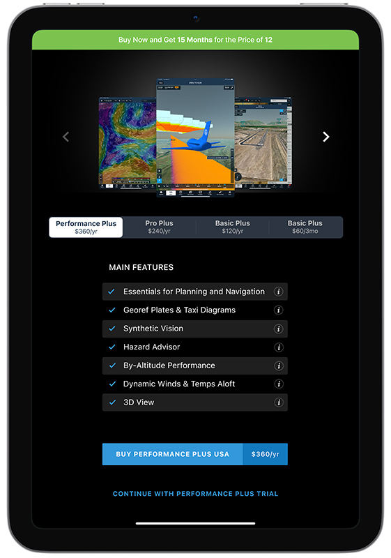
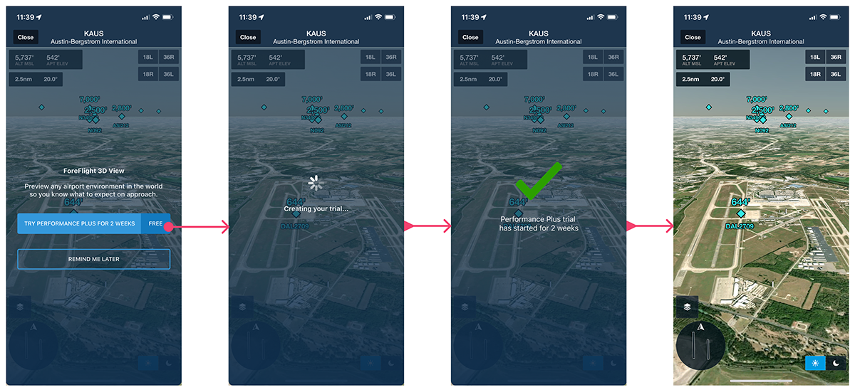
3. Explored full-feature trials to reduce upgrade friction
For some users, asking for an immediate upgrade was too much friction. We explored trial-based entry points that allowed pilots to experience premium value before committing to a higher plan.
One direction introduced a two-week full-feature trial from relevant locked states or empty states. Instead of only asking users to buy a higher plan, the experience could invite them to try the feature first.
This was especially useful for features where the value is easier to understand once the pilot sees it in their own workflow, such as Profile View or Airport 3D.
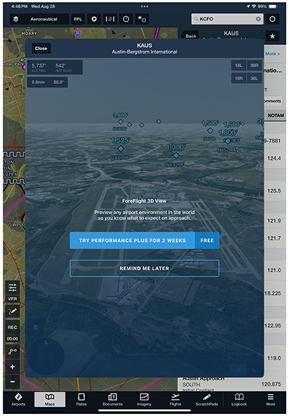
Trial entry points reduced commitment friction by letting pilots experience premium value before upgrading.
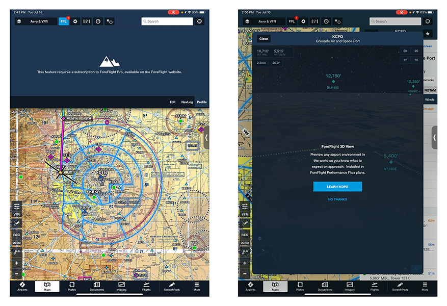
4. Turned empty states into educational growth moments
Some upgrade opportunities were better handled through empty states rather than modals.
For example, if a user entered Profile View without the required plan or without the setup needed to see useful content, the empty state could explain what was missing and provide a relevant next step. This allowed the interface to educate the user without feeling disruptive.
The empty-state approach was especially important because it created a softer growth pattern. It gave users information and choice while keeping them inside the flow they had already started.
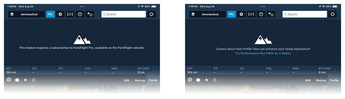
Before and after empty states for Profile view. Empty states became educational surfaces instead of dead ends.
5. Defined trigger logic to avoid showing upsells at the wrong time
A major part of the project was deciding when not to show the upsell.
Because ForeFlight is used in flight planning and in-flight scenarios, we needed to avoid interrupting pilots during sensitive moments. I worked through logic for user state, plan eligibility, trial history, modal frequency, connectivity, and flight status.
The logic considered questions such as:
- Is the user currently in flight?
- Is the user connected to the internet?
- Has the user already used a full-feature trial?
- Has the user already seen this upsell?
- Has the user already upgraded?
- Should the experience fall back to the current production UI?
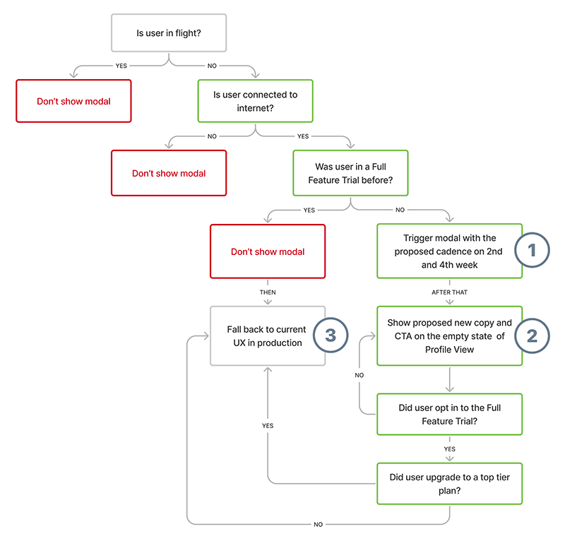
Trigger logic helped determine when to show, suppress, or fall back from an upsell experience.
6. Designed the full upgrade flow, not just the prompt
The experience needed to support what happened after the user tapped the CTA.
I designed loading, confirmation, success, and fallback states so users understood what was happening during trial creation or plan upgrade. These included states such as “Creating your trial…” and “Upgrading your plan…”
These details mattered because subscription changes could involve account, billing, or connectivity dependencies. The flow needed to feel responsive and trustworthy from the initial prompt through the final confirmation.
The growth experience included the full post-CTA journey, not only the initial prompt.
7. Adapted the experience across iPad and iPhone
The initiative focused primarily on ForeFlight Mobile, so I designed and reviewed both iPad and iPhone versions of the experience.
On iPad, there was more room to show context, feature imagery, and supporting copy. On iPhone, the experience needed to be more compact, with tighter hierarchy, shorter copy, and clear CTA placement.
The design pattern needed to feel consistent across devices while adapting to the different ways pilots use ForeFlight on each screen size.
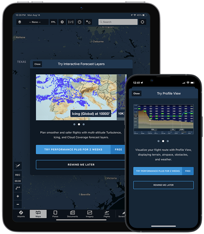
The same upgrade logic adapted across mobile layouts, screen sizes, and usage contexts.
RESULT
Higher-tier subscription conversion increased by 16.4% year over year
The growth initiative contributed to a 16.4% year-over-year increase in conversion to higher-tier subscription plans.
The result validated the core strategy: users were more likely to upgrade when premium value was explained in context, at the moment they were already trying to use the feature.
By connecting upgrade prompts to real user intent, we created a system that supported both the business goal and the pilot’s workflow. The experience helped users understand why a premium feature mattered, gave them a clearer path to try or buy, and avoided unnecessary interruptions during moments where trust and focus were critical.
REFLECTION
Growth design works best when it feels like product education
This project reinforced that effective growth design is not about adding more prompts. It is about understanding when a user is most receptive to learning about value.
The best-performing moments were the ones tied directly to intent. If a pilot tried to use Profile View, the experience explained Profile View. If they tried to use Plates on Maps, the experience explained how that feature improved IFR workflows. The message was specific, useful, and timely.
The biggest design challenge was balancing conversion with trust. In an aviation product, users need to feel that every interaction is intentional. The final approach respected that by using contextual messaging, trial opportunities, trigger logic, and complete upgrade flows to create a growth system that felt helpful rather than intrusive.